How does having a mobile friendly website affect your business?
Having a responsive website design is extremely important in todays world. Everyone has smart phones and tablets so making your website adapt to smaller screen is import to keep your business online footprint alive.
In fact, 40% of users have gone to a competitor’s website after a poor mobile experience. Not only does poor mobile experience effect a users experience, it also effects the ranking within google search engine.
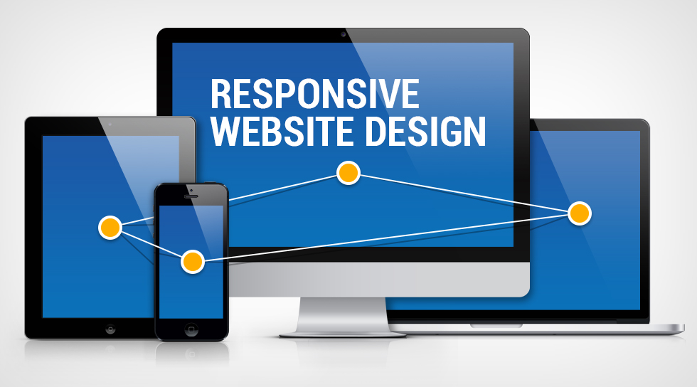
What is a responsive website design?
A responsive website design allows the content to change and adapt to the screen size and allows a user to have a better experience on your website. This is a concept that we have adapted here at Aspired Websites and we build every website using the "mobile first" concept.
Some things that makes a website responsive:
- Readable text without having to pinch to zoom
- Making sure items that tap zones are not close to each other
- Users don't have to slide left and right to see all your information on a page

Increase traffic from mobile users
When websites were first being developed, website designers would create two different websites. The first one would be for desktops and then the second one would be for mobile devices. Many still do this today, but with the increasing searches from mobile users, two separate websites for one site is a time consuming disaster and comes with a high maintenance practice.
Many still do this today. But with ever increasing viewership from mobile users, having two separate versions of one website is a time consuming and high maintenance practice. With todays practices you just need one responsive website that can be accessed by all devices. Users might also re-visit your website some other time when they are searching for services or items you provide.
Provides a Seamless User Experience
This is by far one of the greatest benefits of having a responsive website. Unresponsive websites usually distort the way your website appears on devices like mobile, and tablet.
Whereas desktop viewers might have no problem viewing your website, but the same cannot be said for mobile users. Texts are jumbled, images do not align and users have to scroll through endless pages in search of the information they need. This makes it a pain for users to use your site smoothly and seamlessly.
A Responsive Website Improves Your SEO Efforts
Responsive websites have a greater likelihood of ranking high in SERPs.
The ‘user focused’ experience, and high-quality content could increase your dwell time. Thereby making users stick around for the long run.
Google recommends a responsive website design pattern. Besides, it makes for a good user experience and improves your SEO efforts across all platforms.
In conclusion, having a responsive website can save you lots of money, maintenance time and also help you to convert and retain more clients in the long run. Contact Us to get your responsive website started today!